Thumbs Up, Thumbs Down: A Siskel and Ebert Approach to Website Reviews

Hello again, readers. This second post for today is going to again deal with the screen layout literature that I previously spoke about in the first, but in a much different way. Using this literature as a basis, I have been tasked with reviewing two websites of my own choosing with the caveat being that one must be a website that I approve of while the other should be one that I do not. Naturally my satisfaction or lack thereof is to be based primarily on their layout and design.

The factors that helped me to choose my “thumbs up” website are the factors that are practically nonexistent in my “thumbs down” site. For those that read my previous blog post on the topic, you should already be familiar with these factors, but I explain them here again for the purpose of this assignment, which I am to write in a format resembling an academic paper while being allowed to present it on this blog. I have also cited literature that I did not discuss on the first post from earlier today, so there are fresh elements to keep things interesting.

Thumbs Up Website – Edmodo

I choose Edmodo as my website that I feel exhibits many of the features of good layout and design. I presented this same website in class as part of a show-and-tell of useful technology in which my fellow peers and I took turns introducing and explaining in detail some sort of technology that we felt our peers might not be aware of or, at the very least, not have a deep understanding of.

Edmodo, at its core, is a website designed to help teachers increase the efficiency of their classrooms. Teachers can create groups for each of the classes they teach and then invite their students to join these groups, and the service itself, without students ever having to give their personal email addresses to the teacher. This certainly eliminates any concerns over privacy issues that academic institutions might have, particularly at ones where students are not given a school email address. Once both teacher and students are signed up for Edmodo, the teacher can use the site to give students assignments, send reminders, create quizzes and tests, and much more. Students, in turn, can submit assignments via file upload, takes quizzes and tests, post questions for the teacher, etc. Teachers can also mark submitted work and assessments right on the site and have the results shown to their students immediately. It is this kind of functionality that contributes to the perceived usefulness of the website, which is now being utilized by thousands of teachers around the world (Davis, 1989).

Edmodo is also as simple or as complex as you wish to make it. The decision of which features to use is entirely up to the teacher and nothing will appear under the group for a given class unless the teacher specifically creates and posts it. Until that time, icons for creating things such as assessments, polls, and assignments sit up at the top of a class’ group page, completely out of the way and undistracting as can be seen in Figure 1 below. It is this design choice that also gives Edmodo its perceived ease of use, as teachers can find the tools they want to use quickly, but are not distracted by unused elements taking up screen space (Davis, 1989).
edmodo1
Figure 1: Screenshot of an Example of an Edmodo Group

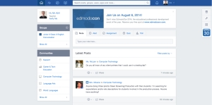
If we need a reason to further delve into the aesthetic side of Edmodo, we can refer back to the work of Kurosu & Kashimura (1995), who discovered a high correlation between interface aesthetics and perceived usability. It was Altaboli & Lin (2011), however, who defined what makes a website aesthetically pleasing, citing the three elements of unity, balance, and sequence as necessary in a site’s design in order for it to be considered so. Looking at Figure 2 below, Edmodo clearly exhibits these traits. It has uniformity across all pages in terms of fonts, colors, and even icon design, which utilizes an outline-type design with a great amount of empty space in the center and no color fill. Balance is achieved by the use of significant white space on the sides to keep the main elements of each page centered while also using a smaller amount between elements to keep them from blending together. Sequence is present as the page naturally flows from left to right and top to bottom as one would expect. Icons, as previously mentioned, are placed in locations that make sense without being distracting.

edmodo1
Figure 2: Screenshot of Edmodo’s Main Screen After Login

Because Edmodo follows a design style typical of many popular social networking sites such as Twitter and Facebook, it can be said that it has a high level of prototypicality. Everything is where we have come to expect certain items to be, with the features relating to the main site itself, such as the home button and search field, located in the upper left and continuing along the top, while navigational menus that are found once you are on a group page are located to the left. Even the icons for creating the various content items are set up much like the status update field of Facebook, located directly under the main site icons at the top and complete with tabs to change the type of content we are creating. This high level of prototypicality keeps users from wasting time getting their bearings on a page and allows them to begin adding or editing the content they are interested in immediately (Tuch, Presslaber, Stocklin, Opwis, & Bargas-Avila, 2012; Roth, Tuch, Mekler, Bargas-Avila, & Opwis, 2013). In my own usage, I have found that I can easily navigate to the group for the class I want upon logging in and from there immediately find the assignment submissions I wish to view or create the content that I need to send out to my students.

Overall, I believe this combination of perceived usability, perceived usefulness, and the aesthetic features that help to bolster these things are a driving force behind Edmodo’s consistently growing number of users. The fact that Edmodo is also fully customizable so that teachers can tailor it to their needs while also being a completely free service simply increases the overall satisfaction that this site gives its user base from the very first time they sign on.

Thumbs Down Website – Yahoo Japan

I chose Yahoo Japan as my “thumbs down” site as we had discussed it briefly in my class and the discussion we had about it was interesting so I wanted to bring that discussion here to my blog as well. Yahoo Japan seems to suffer from, quite simply, being a Japanese website. In fact, I, and many of my classmates, are convinced that a majority of Japanese websites are built on the premise of trying to fit as much content onto the screen as possible at any given time. Figure 3, which follows this paragraph, clearly demonstrates this apparent design choice. The American version of Yahoo is certainly not this cluttered.

yahoo1
Figure 3: Screenshot of the Yahoo Japan Homepage

The only saving grace of Yahoo Japan is in the fact that it uses white space on the sides to center content, much like Edmodo. Unfortunately, I cannot say anything positive aside from this in terms of aesthetics. The abundance of icons makes finding the content that I want akin to a word search. The small font size also greatly reduces the readability of the website and I am a younger man viewing the site on a Macbook Pro that has a high resolution Retina display. I can only imagine how horrible it must be for someone older viewing the site on a low resolution monitor. The content that the home page displays from the beginning is also seemingly random, with no clear sense behind why the many boxes are in the order in which they appear. At the very least, the search bar is where one would expect, but aside from this, Yahoo Japan has an incredibly low level of prototypicality.

If Yahoo Japan wants to turn things around, they may want to first mirror their American sibling, which has considerably less items in its navigational menus and employs much larger font sizes for headlines and other text. I think that even the U.S. site could use more white space between articles on its main page, but I understand that it is a news site and it wants to still keep at least 4 or 5 articles on the screen at any one time. It is still leaps and bounds above Yahoo Japan in terms of allowing me to find content that I am interested in and navigating back and forth between various pages on its site.

It would be easy to condemn the designers of Yahoo Japan if it were not for the fact that popular Japanese sites such as mixi are also cluttered messes. It makes me wonder what those that pursue web design as a career in Japan are taught inside the classrooms of their vocational schools. As someone who is well-versed in web design, I am sure that the answer might horrify me, but I would love to hear back from you and get your opinions on the matter, dear readers. Is this an actual phenomenon in Japanese design or am I just perceiving it as such because the two sites I mentioned just happen to be some of the most popular in Japan in recent history? I would also appreciate links to some well designed Japanese websites. While I do not believe all Japanese websites suffer from this problem, having actual evidence of such would be nice as my own web searches are seeing my inner web designer sink into depression.

 
References

Altaboli, A., & Lin, Y. (2011). Investigating effects of screen layout elements on interface and screen design aesthetics. Advances in Human-Computer Interaction, 2011(5), 1-10.

Davis, F. D. (1989). Perceived usefulness, perceived ease of use, and user acceptance of information technology. MIS Quarterly, 13, 319-340.

Kurosu, M, & Kashimura, K. (1995). Apparent usability vs. inherent usability: experimental analysis on the determinants of the apparent usability. Proceedings of the SIGCHI Conference on Human Factors in Computing Systems. New York: ACM Press. http://portal.acm.org/citation.cfm?id=223355

Roth, S. P., Tuch, A. N., Mekler, E. D., Bargas-Avila, J. A., & Opwis, K. (2013). Location matters, especially for non-salient features–An eye-tracking study on the effects of web object placement on different types of websites. International Journal of Human- Computer Studies, 71(3), 228-235.

Tuch, A. N., Presslaber, E. E., Stocklin, M., Opwis, K., & Bargas-Avila, J. A. (2012). The Role of Visual Complexity and Prototypicality Regarding First Impression of Websites: Working Towards Understanding Aesthetic Judgments. International Journal of Human- Computer Studies, 70, 794-811.

Using Interface and Screen Layouts to Increase User Base

Hello, readers. Long time, no see. Crunch time at the end of the term both at work and at grad school had severely limited my blogging time, but you will have a number of posts to look through as I focus my efforts on meeting deadlines for my class. As usual, I will not rush anything to publication so if any of the topics are covered briefly, it is only from my own lack of interest in fully engaging with it. Today’s post will certainly not fall under that category as I am extremely interested in screen and interface layout as a web designer. Why should you care about this topic if you are an educator with no professional-level foray into game creation or web design? Well, if you are following this blog and want to be a teacher that incorporates as much technology into their teaching style as possible, then you will most likely create a web page, however simplistic in design, at some point. That or you will be advising students who are creating a web page for a project that they are doing for your class. You may never develop a game for educational use, although I will attempt to convince you to try in an upcoming post, but having working knowledge of what makes for a good screen/interface layout is helpful. It is certainly one of the first things that you must consider before creating a web page, and even more important if you are crafting an entire website.

I will look at a number of articles that I found interesting on this topic, probably covering about three of the eight that were read for the class. Each article focuses on slightly different elements or has differing results from what the researchers expected based on previous research done in that area. The oldest of the articles is from back at the end of the 1980’s. Davis (1989) wrote back then about how the perceived usefulness and the perceived ease of use of any kind of information technology was a critical factor in that technology being accepted and widely used. Keep in mind that we are talking about perceptions here. Regardless of the truth of the matter, Davis’ study focused on whether a user believed a given system enhanced their job performance as well as whether they believed using a system to be effortless (p. 320). Davis is even careful to warn readers at the end of his article that the results are not based on objective reality, only the subjective appraisal of the participants (p. 335).

The fact that this study was done on electronic mail is, in itself, interesting, but let us take a moment to think of the real implications here. Even if an interface’s or a website’s layout is complex beneath the surface, with numerous functions and capabilities, if it looks easy to use and users can see a real purpose for its existence, they will become regular users. For us educators, we may want our students to use a webpage or website that we construct to go along with our class, or we may have designed a simple game to help them study something like vocabulary. From Davis’ research, an educator looking to do something along these lines must, at the onset of the design phase, start considering how they will construct something that their students will instantly see as beneficial while also not requiring any sort of a learning curve.

Consider Facebook for a moment. I have not yet begun to cover social media, but nevertheless, it can be used for the purpose of our discussion here. At its core, Facebook has a great number of features that have to be learned if you really want to master it, but at first glance, it looks surprisingly easy. I find my friend, I click on a button to “add” them, and when they accept my request, I begin seeing all of their posts, pictures, etc. on my News Feed as soon as I visit the site. I can easily see how useful Facebook is for keeping up with people that I might not have many chances to meet in person so that drives me to continue using it. Of course, I may find out later that I need to learn how to upload photos, create albums, and play games with friends (which I personally avoid like the plague), but I became a user because it all seemed simple enough and I saw value in the system. Now I cannot claim that it is all due to the two factors Davis found, as many people are likely to do something just because everyone else is, but I am sure that these factors still contribute, particularly for those who may not be as comfortable with computers and the Internet, yet who still use Facebook.

Altaboli and Lin (2011) focused more on screen aesthetics in their research and how these affect a user’s perception of what they are being presented with. In the article, they mention previous research done by Ngo et. al. that proposed fourteen measures of screen aesthetics. These measures were balance, symmetry, equilibrium, unity, sequence, density, proportions, cohesion, simplicity, regularity, economy, homogeneity, rhythm, and order (p. 2). Altaboli and Lin, however, decided to focus only on balance, unity, and sequence based on the findings of earlier research by Ngo and Byrne. Completely subjective as my opinion is, I agree that these elements are factors that are present on websites that are aesthetically pleasing, whereas the other elements such as economy and proportions do not seem as crucial.

What I took issue with, as did those classmates with whom I discussed this article, is the experimental design used by Altaboli and Lin. In fact, much of it has to do with the participants, of whom there were only 13 (p. 4). That alone is not enough to obtain statistically valid results, although Altaboli and Lin claim otherwise (p. 5). Among some of the other grievances is that the participants included only three women, the age range of the participants was limited, with a median age of 29.3 years of age and a standard deviation of only 6.1 years, and finally, all of the participants were graduate students of engineering (p. 4). I also took issue with the fact that one of the screens that should have scored low because it did not possess any of the characteristics mentioned above actually scored quite high, yet Altaboli and Lin eventually write it off as experimental error, saying that effects of some of the other fourteen elements should later be investigated just to be sure that those are not causing the result (p. 6).

Still, I did like that Altaboli and Lin created a regression model and utilized it along with already existing survey data for 42 websites, despite their formulas originally being designed for data entry screens. The result was that they found correlation between the values computed by the model and the scores on the website questionnaires for items that dealt with the visual layout of the site (pg. 7). I would like to see them redo their experiment with a larger variety of participants and then use that data along with the website questionnaires, which did have an adequate number of participants as well as adequate variety. Until then, I can only continue to subjectively look at websites that I find aesthetically appealing and check if the three elements singled out in this study are present or not.

Finally, we have the study done by Salimun et. al. (2010). This paper was interesting to me because another paper coauthored by Salimun (in the same year, no less) had indicated that users actually preferred a medium level of aesthetics for an interface, yet this paper indicates that the higher the aesthetic level of an interface, the better the response time a user would have with a searching activity (Conclusion section, ¶2). In practical application, this would correspond to how fast a user could find what they are looking for on a web page, for instance. In this study, six elements were looked at compared to the three from Altaboli and Lin’s study. The six elements included cohesion, economy, regularity, sequence, symmetry, and unity (Methodology section, ¶1). Thus, two of the three elements from Altaboli and Lin’s study are present.

Again, I found that the number of participants was quite low, at only 22, but they were split evenly between males and females and they all came from different backgrounds of study. Unfortunately, they were also all computer literate and used computers daily, whereas I would have liked to have some participants who rarely used computers participate (Participant section, ¶1). Nevertheless, we can gather from this study that a website or interface with a high level of aesthetics as measured from the usage of the aforementioned six elements would have a greater chance of increasing user response time than one that does not. If we indeed believe in the study’s results and design our project using these measures, assuming it produces the intended results, then it would also likely increase the perceived ease of use. Users would quickly find what they are looking for rather than getting lost during navigation, which generally causes frustration. As I mentioned with Davis’ study at the very beginning, perceived ease of use is what draws users in and keeps them coming back. While the use of aesthetics may not cover the perceived usefulness aspect of Davis’ study, it does cover the other half and is thus something that must be considered when designing any site, application, or game if it is to succeed.

 
References

Altaboli, A. & Lin, Y. (2011). Investigating effects of screen layout elements on interface and screen design aesthetics. Advances in Human-Computer Interaction, 2011, 1-10.

Davis, F. D. (1989). Perceived usefulness, perceived ease of use, and user acceptance of information technology. MIS Quarterly, 13, 318-340.

Salimun, C., Purchase, H.C., Simmons, D., Brewster, S. (2010). The effect of aesthetically pleasing composition on
visual search performance
. Paper presented at NordiCHI 2010, New York, New York: ACM.

HTML: Foundation of the Modern Internet

Hello again, readers. Less than 12 hours after publishing my blog post about Google, I am back again with yet another update. This time I only have one article that I am reviewing and so this is likely going to be my shortest blog post to date. The topic for discussion today is one that is near and dear to my heart: HTML. Many of you might look at HTML code and it would look no different to you than the famous neon green code of Matrix fame. I first cracked the code of HTML when I was about 15 or 16 years old, back in the days of dial-up Internet and the dominance of America Online (AOL) in the Internet Service Provider (ISP) arena, when I taught myself how to code web pages from scratch using HTML without the aid of any programs such as Dreamweaver.

If you are unfamiliar with many of the terms I used above, worry not. Knowledge of HTML and website design is not needed as the piece I will be looking it is actually an early chapter out of a book and gives an introduction to the wonderful world of HTML. Before I get into the various topics covered in the chapter I read, I feel that I should air a few grievances I first, while others are sure to follow later.

In a chapter that seems to be aimed at novices with no knowledge of writing HTML or how the Internet works, Blake (2013) attempts to cover too much in just 23 pages (24 if you count the notes) and extends into areas that novices will have a hard time understanding as they are likely to still be trying to wrap their heads around the few basic HTML tags that are introduced. In addition, this chapter begins with the topic of the Internet being great for finding primary source materials for lessons, but quickly jumps to a lesson on the history of the Internet, only to revisit the topic of the Internet as a useful tool in foreign language (FL) classrooms in its final pages (pp. 25-27). I believe the author should have simply made this chapter into two distinct chapters, having one focus on the history of the Internet and rise of HTML and the other focusing on the usefulness of the Internet as a tool for enhancing learning in FL classrooms. Those grievances aside, I want to now take a deeper look at the content of the chapter, varied as it may be.

The chapter starts with some statistics concerning the enormous growth of Internet usage worldwide since the year 2000 as well as a breakdown from a report done on the activities teenagers are using the Internet for. Unsurprisingly, the most popular of these activities is processing email at 89%, while buying merchandise is the smallest percentage mentioned at 43% (p. 25). These statistics might be useful in enlightening educators who are completely out of touch with the types of activities their students like to engage in when it comes to technology, but for the rest, it just punctuates already familiar knowledge with some handy numbers to go along with it. The first section then ends with the aforementioned talk about the Internet being a prime place to find authentic source material for teaching foreign languages.

From here we get the entire history of the Internet recounted to us, going as far back as the 1960’s and the precursor to the Internet, ARPANET, which was funded by the US Department of Defense’s Advanced Research Projects Agency, or DARPA for short (p. 28). Again, this seems very misplaced in a chapter that begins and ends with talk of how the Internet can be used inside a foreign language classroom.

Following this history lesson, Blake goes on to introduce us to HTML, explaining its purpose and how it works, while even giving a very brief example of some HTML coding. This is forgivable as most novice readers can get by with the explanations provided, but Blake unnecessarily carries on to advanced topics on JavaSCript and PERL that will only serve to alienate and confuse these same novice readers. Furthermore, while Blake explains what you can do with these advanced scripting languages, the applications described, such as interactive quizzes, do not tie in to the point he later makes about how teachers should be using the Internet to promote student-centered learning.

Eventually we do get to the redeeming part of the chapter wherein Blake talks about the common mistakes teachers make in using websites in their FL classrooms. One such mistake is using websites to try to teach grammar in a contextualized way, but still using discrete grammar exercises. In Blake’s view, doing so is a failure to take the Internet’s abundance of authentic material and using it in a way that allows students to be both autonomous in their learning and collaborate with their peers (pp. 39-40). Blake then moves on to talk about a topic that should be familiar to those of you that read my previous blog on Google. Without mentioning the term action competence, Blake speaks of the necessity for students to take their knowledge and apply it to a situation in which it is meant to be used and how more interactive tools are necessary to accomplish this (p. 42).

The final section of the chapter focuses on Task-Based Language Teaching (TBLT) for teaching grammar and how this type of teaching can be accomplished using web technologies. Blake again emphasizes the need for communicative activities that force students to negotiate meaning in order to deal with real-world tasks that they are asked to perform (p. 43). Blake gives some ideas for such cooperative activities, but sadly, the list he constructs for suggested activities contain many items that students perform on their own. This leaves the section feeling disjointed, as was the problem with previous sections. Certainly the entire list of suggestions causes students to engage with the material more than they would have through a lesson following the strict grammar translation method and he gives many ideas for how to help students determine meaning from unfamiliar structures with materials that are above students’ current level. I can acknowledge that as a positive. I do, however, believe that Blake should have separated the discussion on activities for engaging with authentic materials on their own or with teacher support from discussion on activities that involve collaboration with peers that will be more communicative in nature, especially because the section started off talking about cooperative approaches. Were it I writing this chapter, I would have chosen to focus on the cooperative methods as Web 2.0 technologies, as we have been discussing lately, are ideal for crafting activities suited for this style of learning. Bouncing back and forth between activities that can be done alone and then talking about cooperative activities like presentations or writing an essay about cooperative work only serves for readers to miss the point that Blake is desperately trying to make (p. 45).

I would like to read more of this book to see how Blake expands upon certain ideas, but after doing this reading, my fear of being subjected to more disjointed writing and having too many topics crammed onto an insufficient number of pages is likely to keep my experience with Blake’s writing to this lone, isolated chapter.

 
References

Blake, R. J. (2013). Brave new digital classroom: Technology and foreign language learning. Washington, DC: Georgetown University Press.

Doumo Arigatou, Google-sensei!

Hello, everyone. While it may seem that I am churning out blog posts like hot cakes lately (and I very well may be doing just that), I am admittedly behind in covering all of the content that I have read for the purpose of discussion here on this blog. That being said, I will endeavor to not compromise the length of my posts for the purpose of catching up.

This time around we will be discussing none other than Google. Did you know that in Japan, Google is often referred to nowadays as Google-sensei (グーグル先生)? It’s true! For those of you with no knowledge of Japanese, the term sensei is often translated as “instructor” or “teacher,” which is how it is being used here. Of course, the actual meaning of the Chinese characters denotes deeper meaning and in Japan, sensei is not thought of as a title, but gives acknowledgement that the person has more experience than you in a given area. It is used not only for teachers in schools but for doctors and instructors of traditional arts such as budō (Japanese martial arts) and tea ceremony.

Interesting anecdote aside, Google has become so prevalent in many of our lives that it is now the stand-in teacher for all of those times when we do not have someone more knowledgeable at hand to answer questions that we do not know the answer to. It is also much easier to do a Google search than to call up a friend or mentor and have to go through the formalities of conversation (greetings, small talk, detailing the situation and the question at hand, etc.), as I often have my answer seconds after typing out my question. Of course, Google has evolved into much more than a search engine and now has applications and services for a variety of things that are ripe for usage in our classrooms. In this blog post, I am going to be looking at three articles that reference Google’s applications within the realm of education. I warn you now that I am going to be quite harsh on one of them as it sounds more like an advertisement than academic writing. I am also going to hold back on many of my own thoughts about Google and its potential for use in the classroom as I am currently in the process of writing (as of this blog post) a longer academic paper on implementing Google in an academic institution, including potential uses, difficulties with implementation along the way, etc. One article will touch on these things already, but the paper I am writing will be on my own personal experience here in Japan and I do not want to subject you all to the same thing twice when I later share the paper here.

In the article by Barlow & Lane (2007), the authors talk in length about how Arizona State University (ASU) transitioned to Google’s suite of applications tailored to educational institutions, which is known as Google Apps for Education. They first bring up Google Mail (Gmail), noting that ASU was able to transition from their former in-house email solution to Gmail in less than two weeks and give ASU’s 65,000 students an email solution that included 2 gigabytes of storage, enhanced spam filtering, an instant messaging service, and much more (p. 8). The article later goes on to talk about student usage of Google Maps, which they use to view the various ASU campuses, plot buildings and other areas of interest, and even utilize satellite and GPS technology to view real time locations of buses and estimated arrival times. The article also mentions the popularity of the switch to Google Apps for Education, noting that demand was high among faculty members to be switched over from the legacy Exchange service and that students were migrating their accounts at a rate of 300 per hour on the first day that Google’s services went live on the campuses. There is also mention of the ease at which Google allowed for integration with the university’s single-sign-on environment as well as the availability from Google should problems arise with mail or other services that the university’s own help desk cannot handle (p. 9).

Still, looking at the conclusion of the article and seeing “ASU is excited to continue working with Google and will consistently strive to provide its faculty, staff, and student populations with exceptional standards, options and solutions,” I cannot help but feel like this is just a big promotion for both Google and the university, showing that they are up to date with the latest technologies in order to attract more students (p. 10). There is no discussion about how students and faculty can use Google Apps for Education for classes. Google Documents (Google Docs) is mentioned, but its usefulness for collaboration is never once brought up. Nothing remotely negative or related to issues that arose during implementation is found here either. I would expect a more thorough analysis in a piece of academic writing. The uses mentioned are fine, but focusing only on social aspects of the application suite seems unprofessional in my opinion.

Having the advantage of writing his article two years after Barlow & Lane , Herrick (2009) does a much better job at looking at the features more in depth and presenting a case study that includes some of the problems that were experienced by Colorado State University (CSU) when they implemented Google Apps for Education. Herrick also chooses to start things off with a discussion of Gmail and takes readers through the process of implementation, noting the control over accounts that administrators have over certain features (GOOGLE MAIL section). Features not mentioned in the article by Barlow & Lane are highlighted as well, such as the ability to compose mail when offline as well as the search feature built in to the service (Organizing E-mail section, ¶3; Extending Google Mail section, ¶2).

Herrick goes on to discuss Google Calendar next and does an excellent job of highlighting its many features. Users can have different calendars for different types of activities, from classes to social events, and each is customizable as well as shareable, as long as administrators allow it. Speaking of the administrators, university admins can set up Google Calendar to allow everything from equipment to classrooms to be reserved if they so choose (Using Calendars section, ¶2). Integration with in-house systems is also possible so that things such as class days and times can be made to appear on students’ calendars (Managing Calendars section, ¶2).

Herrick moves on to talk about Google Talk for messaging and audio/video chatting, Google Docs and Spreadsheets for creating simplified versions of the kinds of files usually reserved for Microsoft Office or Apple iWork, and Google Sites for creating simple websites that can be published to the web and viewed by anyone if administrators allow. Herrick does make sure to note what I previously mentioned in relation to Google Docs, which is that it allows for collaborative document creation between students. I personally think this feature is great for classes held in computer labs or for giving students the ability to work on group assignments even when they cannot get together outside of class.

Towards the end of Herrick’s article, there is mention of some difficulty with student migration, with many students claiming ignorance of the migration despite numerous notifications. The time that actual migration took was also said to be quite long, clocking in at 7 seconds per account, which may not be a problem for smaller institutions, but CSU was migrating 25,000 accounts (Case Study Revisited: Colorado State University section, ¶2-3). If you are an institution that is giving students access to an email address for the first time, as I am currently attempting to undertake where I teach, this will not be an issue; however, it will take a considerable amount of time creating accounts for every student if your student population is large.

Herrick, too, ultimately rules the implementation of Google Apps for Education a success at CSU, noting the considerable cost savings versus an Exchange server as Barlow & Lane did, and recommends other institutions to get on board with the idea as well. That is two university advocates for the Google Apps for Education suite, for those of you keeping count. Temple University, where I am currently doing my graduate work, also makes use of it, bringing us up to 3. This may sound as though I am setting up for a discussion of an article in which the author criticizes Google, or something similar along those lines, but I am not. The final article that I looked at for this discussion actually revolves around a broader topic, which is Web 2.0 technologies, of which Google Apps are a part, and their use in competency-oriented design of learning.

Not wanting to make this topic too dense and unapproachable for the casual reader, I must nevertheless note that this article revolves around two key concepts: constructivist theory of learning and action competency. The first is easy enough to understand. Constructivist theory, without being a pedagogy per se, deals with the idea of learning through experience. “Learning through doing” would be another way to describe this. Constructivist theory is often mistakenly assumed to mean that students are wholly responsible for the learning taken place and that the teacher merely facilitates, but since we are talking about learning through experience, this can also be applied to guided learning as well. Action competency focuses on the learning process and is concerned with performed behavior. It deals with knowledge, skills, and motivations of the learner and requires a certain degree of complexity in the challenges that the learner must face.

Without getting more complicated than that, we can now look at what role Google Apps can play in putting these theories into practice. Schneckenberg, Ehlers and Adelsberger (2010) discuss a case study with a course in which the teacher does not create even one lesson during the entirety of the course (p. 757). Instead, Google Apps are used to give students access to course readings, allow them to discuss and brainstorm ideas via Google Docs, critique each others presentations and receive teacher feedback through Google Sites, and to reflect on their own learning via some of these same features as well as blogs and other Web 2.0 technologies (pp. 757-758). The authors cite the increased engagement with the course subject matter as being the main reason for the high quality of student works on both the class presentations and final literature reviews (p. 758).

I also believe that student engagement can be increased using Google Apps for Education even when utilizing a guided teaching style where students are not as responsible for their learning as they were in the case study in this article. Certainly having students brainstorm or collaboratively create documents for assignments or in-class activities is not something reserved solely for student-guided classrooms. No matter what teaching style you are utilizing, Google Apps for Education can clearly help to give students more hands-on experience with the material they are learning and allow them to use it in collaboration with their peers. Any time we make our students think more deeply about what they are learning can only be seen as a success, in my humble opinion. As we move further and further away from lecture-based teaching and the reliance on repetition-based drills, technologies like Google Apps are what give us new ways to help our students develop competency and to continue to expose them to the lesson content when they are outside of our classrooms. For this, I think we can all say, “Doumo arigatou, Google-sensei!”

 
References

Barlow, K. & Lane, J. (2007). Like Technology from an Advanced Alien Culture [1]: Google Apps for Education at ASU. SIGUCCS’07. Orlando, Florida, USA.

Herrick, D. R. (2009). Google This! Using Google Apps for Collaboration and Productivity. SIGUCCS’09. St. Louis, Missouri, USA.

Schneckenberg, D., Ehlers, U., & Adelsberger, H. (2011). Web 2.0 and competence‐oriented design of learning—Potentials and implications for higher education. British Journal of Educational Technology, 42(5), 747-762. doi:10.1111/j.1467-8535.2010.01092.x

Forget the Immigration Issue: The Move Towards Being a Digital Sage

Greetings, readers. You’re getting a double post today as I have quite a bit to say about Marc Prensky and his ideas. The first post dealt with the idea of there being two types of people in regards to technology, digital natives and digital immigrants, and how Marc Prensky felt that today’s students, who all fall under the former category, are not being engaged because their teachers (who mostly fall under the latter category) are not speaking their language. I talked about the problems I had with this notion of digital natives needing to be taught differently and also introduced the ideas of other detractors of Prensky’s ideas. In this post, I will explore how Prensky himself tried to distance himself from the digital native vs digital immigrant debate and moved on to making the claim that we must all learn to embrace technology in order to become digitally wise.

Let’s begin by looking at Prensky’s definition of digital wisdom. Prensky (2009)claims that “Digital wisdom is a twofold concept, referring both to wisdom arising from the use of digital technology to access cognitive power beyond our innate capacity and to wisdom in the prudent use of technology to enhance our capabilities” (¶2). He then goes on to talk about the differences between a digitally wise person and a digitally unenhanced person, noting that technology will never replace intuition, good judgement, one’s own sense of morals, etc., but that the digitally unenhanced person will always be at a distinct disadvantage compared to even the least capable of the digitally wise (¶2).

Prensky touches on something that I mentioned in my first blog post, noting that we already use technology such as electronic storage and mobile phones to offload some of the demands on our own memory (Digital Extensions and Enhancements section, ¶1). Finally, Prensky and I can begin to agree on our views of technology. While there will always be those who worry about some cataclysmic event that renders electronic devices useless, I am not one that believes in ignoring the benefits of technology today to avoid being reliant on it should such events come to pass. Instead, I advocate learning how to do things like growing your own food and learning how to survive out in the wilderness for a weekend or so while still relying on technology for most of what I do in my daily life. I do not think that doing such will cause me to forget how to use a book or write a letter should technology disappear someday, so why not embrace the tools at our disposal?

There is no doubt on my part that what Prensky began advocating in 2009 is true. There are limits to what our minds and our senses can do. In this day and age, I can easily use plagiarism detection software to determine if a student has copied another’s work whereas this same task without technology would either take a significant amount of time or simply would not be possible. Indeed, we are limited in what we can do without technology. Prensky noted several of these limitations, which include our ability to predict the future, our tendency to forget, and many others (Wisdom Enhancement section, ¶2-3). Those who choose to use the latest digital technologies can go beyond these limits. As time goes on, more and more of these limitations will disappear thanks to technology, but only for those that choose to use it and become digitally wise. As Prensky believes, we will someday even be able to read each other’s thoughts, eliminating guesswork and the often erroneous assumptions we make concerning the thoughts of others (Enhancing Our Insight into Others section).

So now that Prensky and I are in agreement and everything seems bright and rosy, where do we go from here? I will again say that I believe that using and embracing technology is not enough. Certainly it is a good start for increasing engagement in our classrooms as students always more readily turn their attention to a screen rather than a book because books are the norm in classrooms, but this may not be enough. We need to think of the best practices for using technology and do further research into ways that technology increases learning in our students. When teaching English as a foreign or second language, showing a video in class can be fun, but if it does not facilitate progress, we need to reevaluate the reason that we are showing it. If it was to showcase some aspect of culture, that’s an entirely different story, but using technology for technology’s sake is irresponsible and unproductive. Something along the lines of digital pen pals, where your class and a class in another country communicate back and forth without any personal information being exchanged, is an example of using technology purposefully as it will force students to use the language productively in order to participate. These are the types of things that we must think about and start writing into our curriculums. Keeping the textbooks and activities that have been around for years is still fine, but we must look at not just introducing technology but using it in ways that enhance our students’ learning. Otherwise, the digitally wise teachers and students of the world may surpass us in their knowledge and ability both.
 

References

Prensky, M. (2009). H. sapiens digital: From digital immigrants and digital natives to digital wisdom. Innovate Journal of Online Education, 5(3). Retrieved from http://www.wisdompage.com/Prensky01.html

Digital Natives and Digital Immigrants: Do We Really Need to Teach Them Differently?

Hello again, readers. I apologize for the delay in getting this second post out. Today I’ll be discussing a few articles on a topic that has been discussed as far back as 2001, when the terms digital native and digital immigrant were first coined by one Marc Prensky. Since that time, numerous debates, from whether such entities actually exist to whether Prensky’s own proposed implications for teaching hold any weight, have raged on (and continue to do so even within the confines of the very class for which I had to create this blog). In this post, I am going to attempt to summarize and reflect on three of Prensky’s articles on the topic, including his initial two-parter that introduced the concept, as well as an article from one of Prensky’s detractors. I will, as always, give my own views on the issues and, hopefully, prompt some of you readers to respond with your own. Once again, the references for the articles I talk about are located at the bottom of this post. Alright, let’s get started.

Nearly 13 years prior to this blog post being written, Prensky (2001a) claimed that the difference between students of the then current generation and those are past generations were not just marginally different, but that a change had occurred that was so monumental, going beyond mere fashion, slang, etc., that there was no turning back (¶2). This change was, of course, the digital revolution, and the current generation of that time was the first to have grown up surrounded by this abundance of technology and information on demand (¶3).

The basis for most of the forthcoming argument from Prensky comes in the form of a quote from a Dr. Bruce D. Berry. The idea is essentially that different experiences lead to different types of brain structures, which in turn lead to different ways of thinking and processing information (¶4). Up until this point, I can agree with the points that Prensky is making, but as we proceed through the rest of this article, the second part published two months later, and the follow-up from 8 years later in 2009, I cannot help but disagree with what Prensky is trying to imply.

Moving forward in the first article, Prensky (2001a), defines the terms digital immigrant and digital native for us. As you might have guessed, digital natives are those that were born surrounded by technology and an endless amount of information at their fingertips ready for consumption. Those that were born before the age of computers and the Internet and who adopted these technologies into their lives are the digital immigrants (¶5-6). The problem Prensky sees is that a bunch of these digital immigrants are now teaching digital natives and are struggling due to speaking a seemingly different language (¶9).

Prensky spends the rest of the article arguing this point. The problem I have with the argument is that while students may prefer to learn from certain types of media, it does not mean that they are incapable of learning from printed material and such. Of course I believe that if instructors want to increase student engagement in the classroom, they can make use of computers, videos, etc., but they can also just as easily have group discussions and student-to-student interactions to accomplish this. The word-for-word recitation of the textbook is a lecture style that has been boring to students long before the Internet came along. Lectures of this style are, more often than not, a result of poor instructor quality, not of a gap between two different generations of people.

Prensky brings up an example of a student who dropped out of university because of this style of lecture, but just as I mentioned in my post entitled “Is the Internet Making Us Smarter or More Stupid?,” this can be attributed to self-discipline issues. If a person frequently allows themselves to be distracted on the Internet, thus weakening their ability to focus, they certainly are not going to be able to focus during a typical lecture.

Prensky also does not seem to even think about those children that grow up in poorer families that could not afford things like computers. Would those students be true “digital natives?” Moreover, what of Japan? Here in Japan, printed materials are held in high regard, especially those used for education. We do not yet see many classrooms moving towards replacing textbooks with iPads and such as we do in the U.S. and elsewhere. Even students that own iPads, iPhones, 3DS’s, etc. still carry around books and manga in print form, despite the fact that both are available digitally. Clearly these digital natives do just fine with printed materials and older methods of teaching.

Let me be clear that my argument is that teaching digital natives differently than students in the past is not absolutely necessary, but I do think that instructors should think of ways to better engage their students whenever possible. Using technology that students are familiar with and enjoying using can liven up what would otherwise be a dull lesson, but it doesn’t have to be used as frequently as Prensky (2001a) seems to have been making a case for. I have to chuckle when I read things such as digital natives being unwilling to go backwards and adopt the old ways of learning, as if they somehow cannot use a book or obtain information from someone speaking to them (¶17). As a digital native, I certainly do not find myself incapable of learning from lectures or textbooks. I have preferences for digital media that I can take with me everywhere with ease, but I can learn from older methods as well.

In the follow-up article, Prensky (2001b) makes some good suggestions for engaging digital natives, such as using learning games, but I doubt that these suggestions apply only to those that grew up with technology (What Have We Lost section, ¶4). Just because a previous generation grew up during a time when boring teaching styles dominated does not mean that they actually preferred the way that they were taught, after all.

Unfortunately, while Prensky does cite certain studies on the effectiveness of these learning games, the vast majority of this second article is spent trying to convince us yet again that there are these two separate groups of learners (digital natives and digital immigrants) and that the former must be taught differently than all the rest. Again, there is much talk about brains being malleable not just in our formative years, but throughout our entire lives. Prensky continues to harp on this physiological difference in the digital natives’ brains and how neurobiologists and social psychologists are all in agreement that input changes with new input (But Does It Work? section, ¶10). I, personally, would like to hear more about the studies done on interactive games and learning activities. Moreover, if our brains our malleable throughout our entire lives and change with new input, could adopters of technology that technically fall under the digital immigrant category not be rewired the same way as digital natives through daily use of technology?

I am certainly not the first one to raise such questions. Bennett & Maton (2010) talked a great deal about these things and more. They noted that papers that followed Prensky’s moved away from ideas that excluded older people with sufficient exposure to technology. While this is certainly a good thing, the ideas that followed Prensky’s also all vary greatly in their ideas about how digital technology affects the younger generations (p. 322). The studies that Bennett & Maton go on to talk about are all quite interesting; however, and make many of the same points that I considered above even before reading the research.

One example is again about the level of access that children have to technology, noting that those children that come from lower socioeconomic backgrounds are less likely to have the type of access to digital technology as those from high socioeconomic backgrounds (p. 323).

I found the research on technology-based activities to be the most fascinating, however. In this section, Bennett & Maton talk about the research that indicates even those that have access to digital technology are not necessarily engaging in the types of activities that others claim they are (pp. 323-324). This certainly falls in line with my experience with my peers, friends, and family members. While a majority of us use digital technology for research and communication, those that partake in activities such as blogging or digital media creation are certainly few and far between. Bennet & Maton’s paper also mentions research on gamers that suggests that while such activities may be common amongst children and teenagers, time and motivation for gaming may dwindle later in life (p. 324). I can attest to this as I have found that while I have and always will enjoy gaming, I do not have the time nor motivation to engage in it as I did when I was younger and didn’t have a job or the workload that I do now.

I could go on through the rest of the paper, but I believe that what Bennett & Maton ultimately tell us is that while a majority of those of us who have access to digital technology use it for communication and other now common tasks, things such as the amount of gaming, content creation, etc. that we partake in varies from user to user. We can certainly do more research, but varying demographics in schools and universities are certainly going to always produce mixed results. This is why Prensky’s original ideas about digital natives and digital immigrants was so off target, in my opinion. Prensky failed to realize that even younger generations of learners do not all have the same level of access to technology and, among those that do, do not engage in the same activities equally. You will have children that love to spend their free time playing games and surfing the Internet, but you will also have those that will go outside to play with their friends or practice sports more than they play video games.

In closing, I will still say that all types of learners (those who grew up with technology and those that did not) can still use textbooks to great effect, but they would certainly be more engaged by a game or other more social activity. Thus, it is up to us educators to learn to integrate these things into our lessons without panicking and thinking that we have to scrap all of the teaching methods from the past.
 

References:

Bennett, S. & Maton. K. (2010). Beyond the ‘digital natives’ debate: Towards a more nuanced understanding of students’ technology experiences. Journal of Computer Assisted Learning, 26, 321–331. doi:10.1111/j.1365-2729.2010.00360.x

Prensky, M. (2001a). Digital Natives, Digital Immigrants. On the Horizon, 9(5), 1-6. Retrieved from http://www.marcprensky.com/writing/Prensky%20-%20Digital%20Natives,%20Digital%20Immigrants%20-%20Part1.pdf

Prensky, M. (2001b). Digital natives, digital immigrants, part II: Do they really think differently? On the Horizon, 9(6), 1-9. Retrieved from http://www.marcprensky.com/writing/Prensky%20-%20Digital%20Natives,%20Digital%20Immigrants%20-%20Part2.pdf

Is the Internet Making Us Smarter or More Stupid?

Hello, everyone. Today I’m looking at three articles that discuss the Internet and it’s effects on our cognitive abilities as well as our learning strategies. If you’d like to read the articles in question ahead of this post, check the reference section at the end. The last article may require you to sign up for a free account over at Science, but it is well worth it if you’re looking for a great database of articles from various physical and social science disciplines, including education.

Let’s begin with the articles by Carr and Shirky. While Carr argues in his article that the Internet is making us “dumber,” Shirky’s article is the antithesis of this idea. Both present valid points, but I personally find Shirky’s article to be the most sensible of the two. Here’s why.

Carr’s article is primarily concerned with attention and the ability to concentrate. Carr (2010) argues that unless we focus on something completely, the proper neural connections are unable to form that allow for more than just the insertion of information into our short-term memory. The problem with the Internet, he asserts, is that it is full of distractions and keeps us constantly multitasking, unable to focus our attention on one thing at a time (¶4).

From here the article is plagued with references to various studies and research that just don’t seem to make a strong enough argument to be convincing. One study that was mentioned concerned how a group that frequently does media multitasking performed more poorly on cognitive tests than a group that multitask less frequently (¶8). In another section, experiments that reveal how quickly neural circuits change in response to stimulus and experience is discussed (¶11).

While I don’t doubt that these things are true and hold some weight, the problem is that Carr fails to talk about the control of the individual. Certainly there are many distractions on the Internet today, with ads and links to other sites littering most pages that we visit. We don’t have to click these, however. While I have been guilty of being distracted by the arrival of a new email on my phone while reading an article in the past, I can just as easily sit down and read through the same article without checking my phone if I so choose. Carr chooses to condemn the medium of the Internet and digital media itself instead of the lack of self-control of the individual. This is the same mentality of those that blame violent video games for the actions of deranged individuals in certain high-profile cases. I, however, am not one to take blame out of the hands of the wrongdoer.

In the last few paragraphs of his article, Carr (2010) seems to be attempting to make a case for printed books versus the Internet, so I wonder if he also views digital versions of books as “evil” (¶13). I could go on and say that part of the reason some people may prefer books to digital versions could be that the devices they read them on provide too many distractions that don’t allow them to concentrate, but that is a topic for a different blog post.

Shirky’s article argues for the Internet as a tool that has increased our mental capabilities. He paints detractors like Carr as fear mongers, much like those who warned of the evils of print in centuries past. While Shirky (2010) does not talk about neurological effects of the Internet, he does point out its efficiency with things such as collaborative efforts where collective cognitive energy is pooled to accomplish something as massive as Wikipedia in less than 10 years time while using 100 million hours of human thought (¶8). Indeed, the sharing of information and near-instantaneous peer feedback that the Internet allows for more than makes up for the distractions it causes that can be overcome with some self-discipline, however hard it may be.

In the last few pages of Shirky’s article, he also calls out other opponents of the Internet who criticize it for its abundance of incorrect information and amateur publications. Shirky (2010) notes that there are, and always have been, far more mediocre materials in print than those of quality (¶10-11). Even before the advent of the Internet age, he says, the majority of people spent more time watching TV than reading (¶14). In the end, Shirky seems to be taking a “you can’t have the good without the bad” stance, which I seem to mirror.

Bohannon’s article, the final of the three, also seems to favor the Internet for the benefits it provides. In one single page, Bohannon (2011) cites how incredibly efficient we are at remembering where information is stored (¶8). The article goes on to discuss how we offload some of the demands on our memory to Google, Wikipedia, etc (¶9). Indeed, while this reliance on technology may not be great for remembering information for tests, in the real-world, we can refer to resources whenever we need them, whether that be a digital source or a book.

After reading these three articles, and perhaps because of my own personal bias for technology, I weigh in on the side that recognizes the pitfalls of the Internet, but realizes that these are small in comparison to the many benefits we get from being so connected to an abundance of information. After all, without the Internet, I could not write this blog and share ideas with all of you.

So where do you weight in, dear readers? Is the Internet is making us smarter or more stupid?


References:

Carr, N. (2010, June 5). Does the Internet make you dumber? Wall Street Journal. Retrieved from http://online.wsj.com/news/articles/SB10001424052748704025304575284981644790098.html

Shirky, C. (2010, June 4). Does the Internet make you smarter? Wall Street Journal. Retrieved from http://online.wsj.com/news/articles/SB10001424052748704025304575284973472694334.html

Bohannon, J. (2011, July 15). Searching for the Google effect on people’s memory. Science, 333(6040), 277. doi:10.1126/science.333.6040.277