Hello again, readers. This second post for today is going to again deal with the screen layout literature that I previously spoke about in the first, but in a much different way. Using this literature as a basis, I have been tasked with reviewing two websites of my own choosing with the caveat being that one must be a website that I approve of while the other should be one that I do not. Naturally my satisfaction or lack thereof is to be based primarily on their layout and design.
The factors that helped me to choose my “thumbs up” website are the factors that are practically nonexistent in my “thumbs down” site. For those that read my previous blog post on the topic, you should already be familiar with these factors, but I explain them here again for the purpose of this assignment, which I am to write in a format resembling an academic paper while being allowed to present it on this blog. I have also cited literature that I did not discuss on the first post from earlier today, so there are fresh elements to keep things interesting.
Thumbs Up Website – Edmodo
I choose Edmodo as my website that I feel exhibits many of the features of good layout and design. I presented this same website in class as part of a show-and-tell of useful technology in which my fellow peers and I took turns introducing and explaining in detail some sort of technology that we felt our peers might not be aware of or, at the very least, not have a deep understanding of.
Edmodo, at its core, is a website designed to help teachers increase the efficiency of their classrooms. Teachers can create groups for each of the classes they teach and then invite their students to join these groups, and the service itself, without students ever having to give their personal email addresses to the teacher. This certainly eliminates any concerns over privacy issues that academic institutions might have, particularly at ones where students are not given a school email address. Once both teacher and students are signed up for Edmodo, the teacher can use the site to give students assignments, send reminders, create quizzes and tests, and much more. Students, in turn, can submit assignments via file upload, takes quizzes and tests, post questions for the teacher, etc. Teachers can also mark submitted work and assessments right on the site and have the results shown to their students immediately. It is this kind of functionality that contributes to the perceived usefulness of the website, which is now being utilized by thousands of teachers around the world (Davis, 1989).
Edmodo is also as simple or as complex as you wish to make it. The decision of which features to use is entirely up to the teacher and nothing will appear under the group for a given class unless the teacher specifically creates and posts it. Until that time, icons for creating things such as assessments, polls, and assignments sit up at the top of a class’ group page, completely out of the way and undistracting as can be seen in Figure 1 below. It is this design choice that also gives Edmodo its perceived ease of use, as teachers can find the tools they want to use quickly, but are not distracted by unused elements taking up screen space (Davis, 1989).

Figure 1: Screenshot of an Example of an Edmodo Group
If we need a reason to further delve into the aesthetic side of Edmodo, we can refer back to the work of Kurosu & Kashimura (1995), who discovered a high correlation between interface aesthetics and perceived usability. It was Altaboli & Lin (2011), however, who defined what makes a website aesthetically pleasing, citing the three elements of unity, balance, and sequence as necessary in a site’s design in order for it to be considered so. Looking at Figure 2 below, Edmodo clearly exhibits these traits. It has uniformity across all pages in terms of fonts, colors, and even icon design, which utilizes an outline-type design with a great amount of empty space in the center and no color fill. Balance is achieved by the use of significant white space on the sides to keep the main elements of each page centered while also using a smaller amount between elements to keep them from blending together. Sequence is present as the page naturally flows from left to right and top to bottom as one would expect. Icons, as previously mentioned, are placed in locations that make sense without being distracting.

Figure 2: Screenshot of Edmodo’s Main Screen After Login
Because Edmodo follows a design style typical of many popular social networking sites such as Twitter and Facebook, it can be said that it has a high level of prototypicality. Everything is where we have come to expect certain items to be, with the features relating to the main site itself, such as the home button and search field, located in the upper left and continuing along the top, while navigational menus that are found once you are on a group page are located to the left. Even the icons for creating the various content items are set up much like the status update field of Facebook, located directly under the main site icons at the top and complete with tabs to change the type of content we are creating. This high level of prototypicality keeps users from wasting time getting their bearings on a page and allows them to begin adding or editing the content they are interested in immediately (Tuch, Presslaber, Stocklin, Opwis, & Bargas-Avila, 2012; Roth, Tuch, Mekler, Bargas-Avila, & Opwis, 2013). In my own usage, I have found that I can easily navigate to the group for the class I want upon logging in and from there immediately find the assignment submissions I wish to view or create the content that I need to send out to my students.
Overall, I believe this combination of perceived usability, perceived usefulness, and the aesthetic features that help to bolster these things are a driving force behind Edmodo’s consistently growing number of users. The fact that Edmodo is also fully customizable so that teachers can tailor it to their needs while also being a completely free service simply increases the overall satisfaction that this site gives its user base from the very first time they sign on.
Thumbs Down Website – Yahoo Japan
I chose Yahoo Japan as my “thumbs down” site as we had discussed it briefly in my class and the discussion we had about it was interesting so I wanted to bring that discussion here to my blog as well. Yahoo Japan seems to suffer from, quite simply, being a Japanese website. In fact, I, and many of my classmates, are convinced that a majority of Japanese websites are built on the premise of trying to fit as much content onto the screen as possible at any given time. Figure 3, which follows this paragraph, clearly demonstrates this apparent design choice. The American version of Yahoo is certainly not this cluttered.
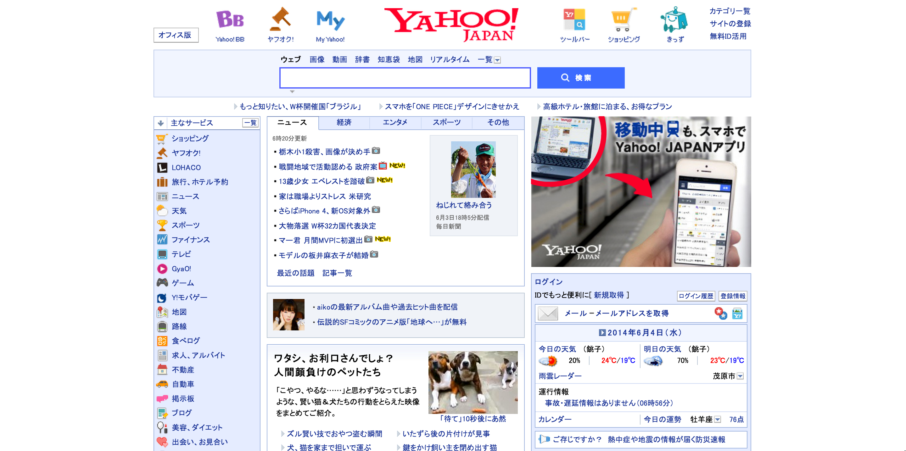
Figure 3: Screenshot of the Yahoo Japan Homepage
The only saving grace of Yahoo Japan is in the fact that it uses white space on the sides to center content, much like Edmodo. Unfortunately, I cannot say anything positive aside from this in terms of aesthetics. The abundance of icons makes finding the content that I want akin to a word search. The small font size also greatly reduces the readability of the website and I am a younger man viewing the site on a Macbook Pro that has a high resolution Retina display. I can only imagine how horrible it must be for someone older viewing the site on a low resolution monitor. The content that the home page displays from the beginning is also seemingly random, with no clear sense behind why the many boxes are in the order in which they appear. At the very least, the search bar is where one would expect, but aside from this, Yahoo Japan has an incredibly low level of prototypicality.
If Yahoo Japan wants to turn things around, they may want to first mirror their American sibling, which has considerably less items in its navigational menus and employs much larger font sizes for headlines and other text. I think that even the U.S. site could use more white space between articles on its main page, but I understand that it is a news site and it wants to still keep at least 4 or 5 articles on the screen at any one time. It is still leaps and bounds above Yahoo Japan in terms of allowing me to find content that I am interested in and navigating back and forth between various pages on its site.
It would be easy to condemn the designers of Yahoo Japan if it were not for the fact that popular Japanese sites such as mixi are also cluttered messes. It makes me wonder what those that pursue web design as a career in Japan are taught inside the classrooms of their vocational schools. As someone who is well-versed in web design, I am sure that the answer might horrify me, but I would love to hear back from you and get your opinions on the matter, dear readers. Is this an actual phenomenon in Japanese design or am I just perceiving it as such because the two sites I mentioned just happen to be some of the most popular in Japan in recent history? I would also appreciate links to some well designed Japanese websites. While I do not believe all Japanese websites suffer from this problem, having actual evidence of such would be nice as my own web searches are seeing my inner web designer sink into depression.
References
Altaboli, A., & Lin, Y. (2011). Investigating effects of screen layout elements on interface and screen design aesthetics. Advances in Human-Computer Interaction, 2011(5), 1-10.
Davis, F. D. (1989). Perceived usefulness, perceived ease of use, and user acceptance of information technology. MIS Quarterly, 13, 319-340.
Kurosu, M, & Kashimura, K. (1995). Apparent usability vs. inherent usability: experimental analysis on the determinants of the apparent usability. Proceedings of the SIGCHI Conference on Human Factors in Computing Systems. New York: ACM Press. http://portal.acm.org/citation.cfm?id=223355
Roth, S. P., Tuch, A. N., Mekler, E. D., Bargas-Avila, J. A., & Opwis, K. (2013). Location matters, especially for non-salient features–An eye-tracking study on the effects of web object placement on different types of websites. International Journal of Human- Computer Studies, 71(3), 228-235.
Tuch, A. N., Presslaber, E. E., Stocklin, M., Opwis, K., & Bargas-Avila, J. A. (2012). The Role of Visual Complexity and Prototypicality Regarding First Impression of Websites: Working Towards Understanding Aesthetic Judgments. International Journal of Human- Computer Studies, 70, 794-811.

[…] focusing on the paper by Houser and Thornton as well as referring to the CMS that I introduced in this blog post, […]
[…] critic it, along with providing basic information about the journal itself. It is quite similar to my website review that I posted a few weeks ago. Following this post, I am now on my own in terms of choosing content […]